
Visualization
Introduction
This feature requires separate licensing.
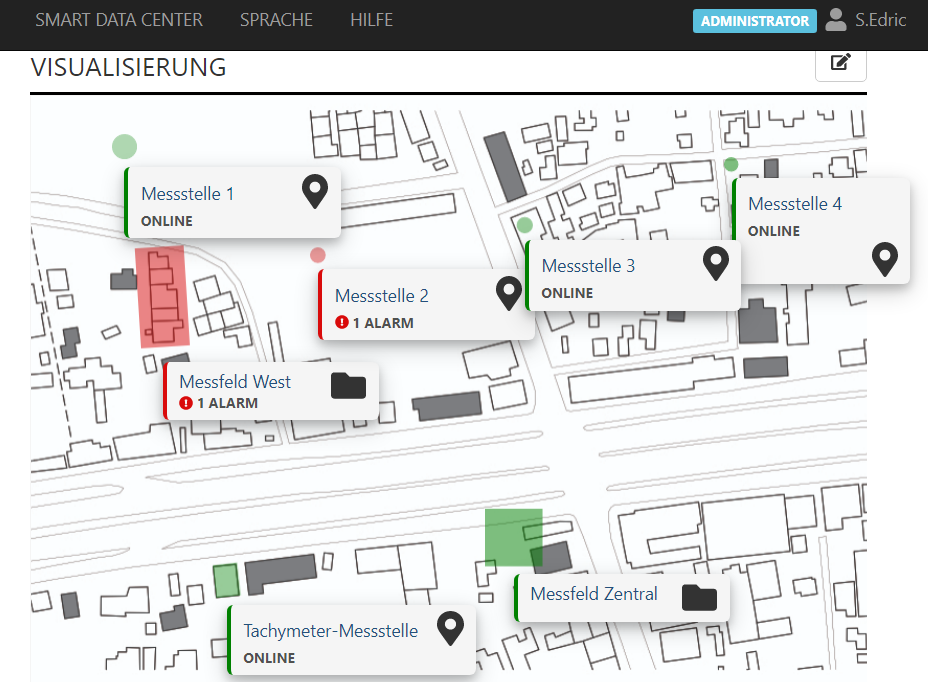
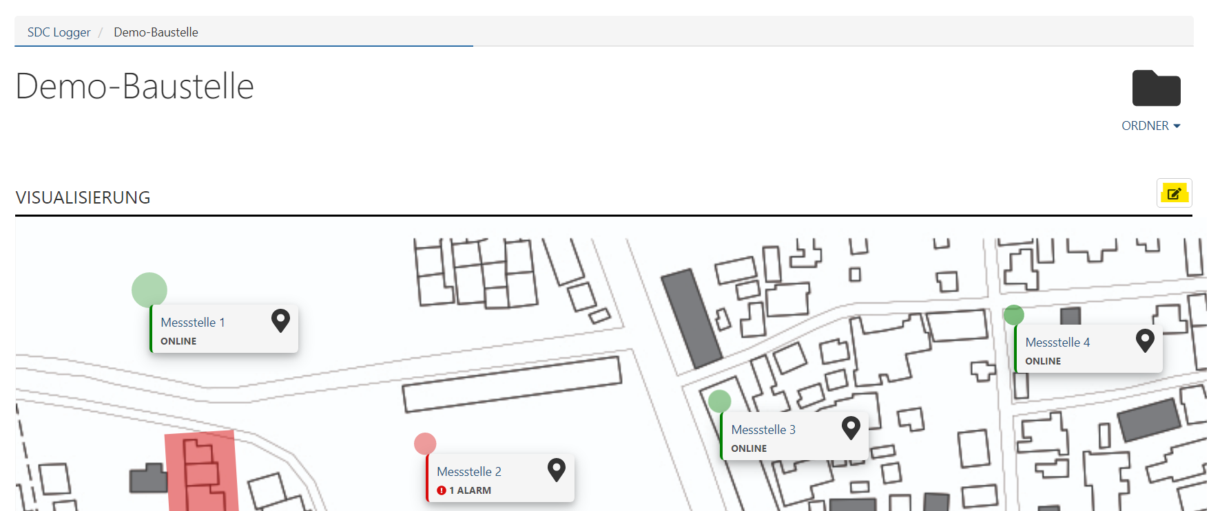
In Sedrix, “visualization” offers the possibility of displaying large and complex projects in such a way that users can find their way around intuitively.
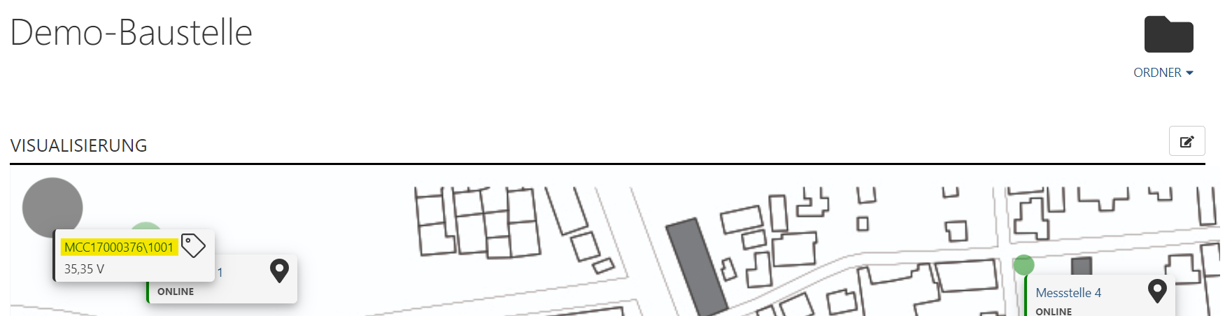
This is made possible by the user being able to upload image files (e.g. a construction site plan) to Sedrix. Icons representing the individual measuring points can then be placed freely on these images. The icons can therefore be arranged so that their position on the construction site plan corresponds to that of the actual measuring point on the construction site. Clicking on an icon leads directly to the corresponding measuring point. Color markings show at a glance which measuring points are currently online or offline.
The following chapter explains step by step how you can set up, adapt and use this function.
Set Up Visualization
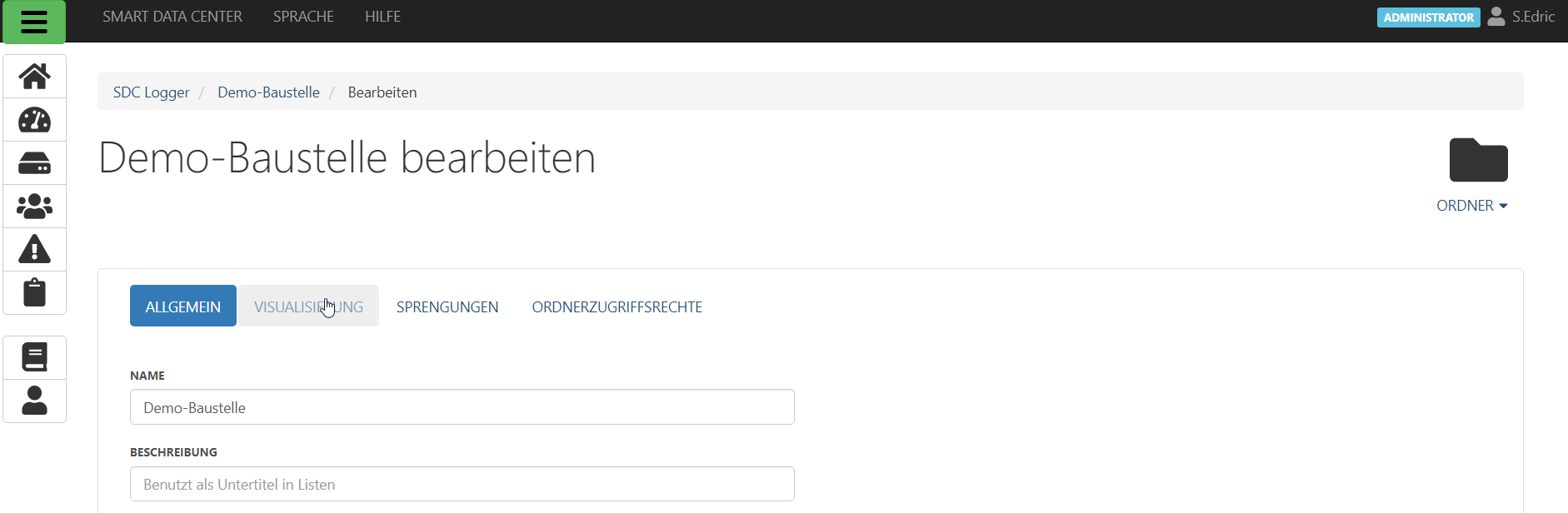
German terms as found in the included screenshots below are translated as necessary in brackets. To set up visualization, click on the folder icon 

The Edit page is opened. Select the “Visualization” tab here (Visualisierung).
Now the page on the right appears:
How the visualization is displayed can now be configured on this page. The individual settings are explained in detail below:
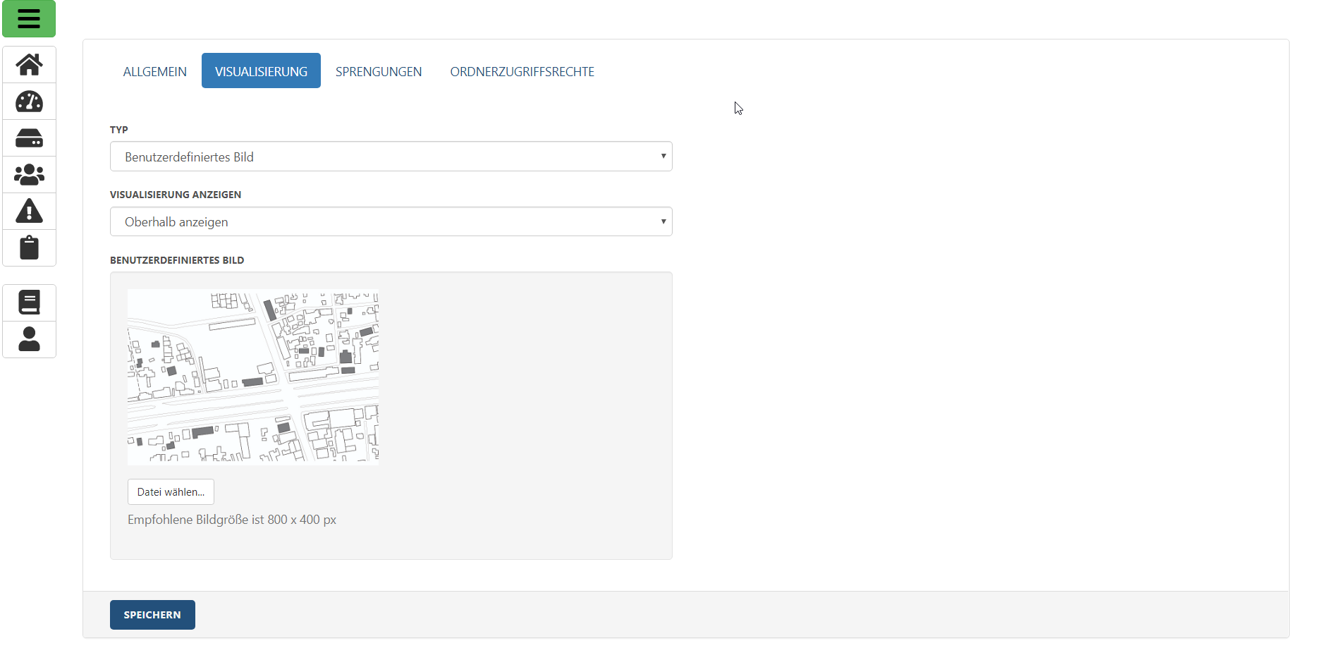
Type: In the dropdown menu you can choose between the items “Google Maps” and “User-defined image” (Typ).
Google Maps: Here you can enter any geographic position as a coordinate, which then uses a section of a Google Maps map as a background for the visualization.
User-defined image: You can upload an image of your choice as a background for the visualization (Benutzerdefiniertes Bild).
Google Maps support expired at the end of 2019, and the feature is expected to be removed in future versions.
Show visualization: Allows you to set whether or where the visualization is displayed.
Not displayed: The visualization is not displayed.
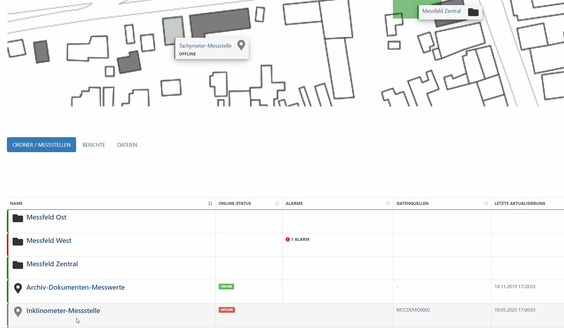
Show above: The visualization appears directly on the main page of the associated folder, above the list of measuring points and folders.
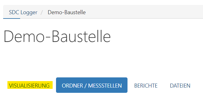
Show in tab: In the folder view, the visualization does not appear directly on the main page, instead it is located in a separate tab called “Visualization” (see picture below).
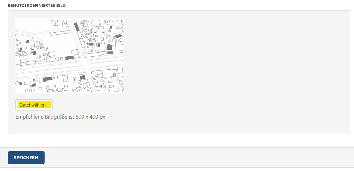
User-defined image : Under this point, a user-defined image can be uploaded using the “Select file” button (Datei wählen). If an image is uploaded for visualization, a preview of the image appears at this point.
Once the desired settings have been selected and a suitable image has been uploaded, the “Save” button (Speichern) can be clicked to save the changes and return to the folder main page.
Adapt Visualization
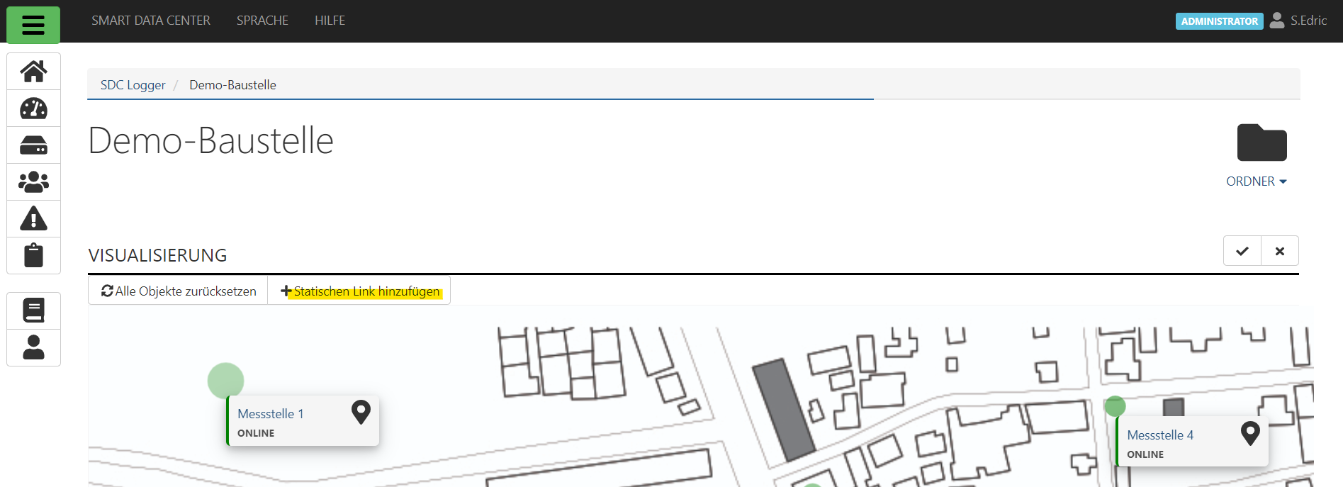
If an image has been uploaded for the visualization, you can now start adapting the visualization on the folder main page. Icons can be freely placed on the visualization. These are linked to measuring points or folders, or lead to static links that you have entered yourself. In the following, these icons are referred to as markers .
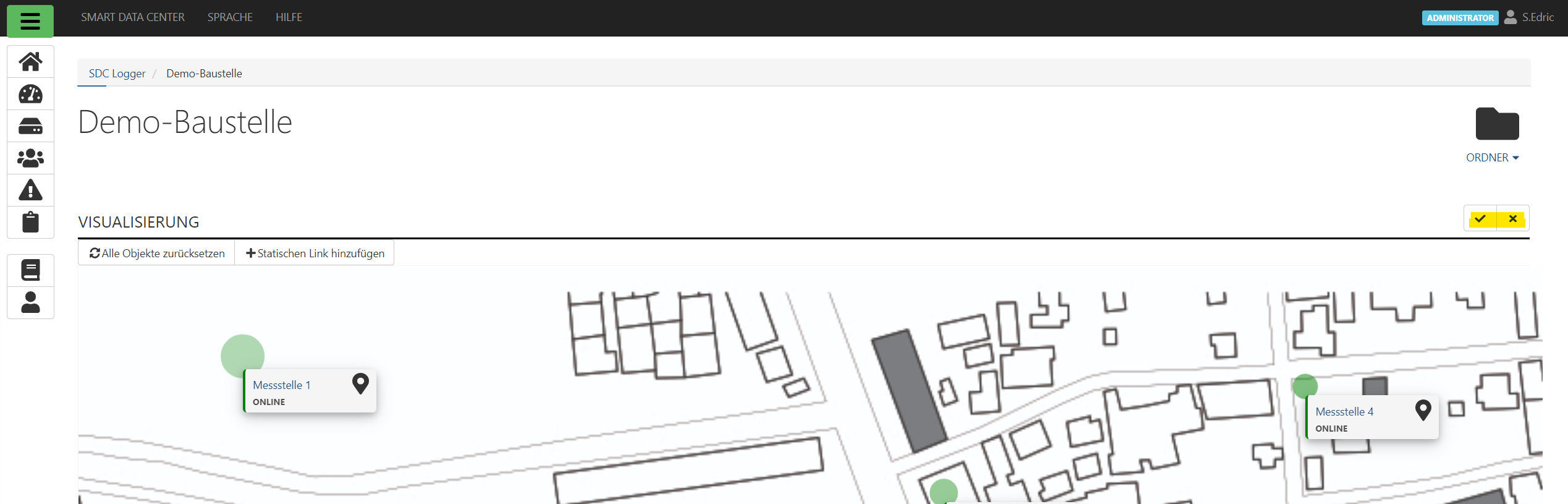
To open the visualization, click on the edit icon on the folder main page under the folder symbol

Once the modifications have been completed, make sure to save your changes. Alternatively, the changes can also be discarded and thus reversed. As soon as the edit mode is activated, the edit button disappears on the right above the visualization and is replaced by two buttons for “Save changes” (tick icon ) and “Discard changes” (X icon ) replaced. A click on the respective button confirms or discards the changes and exits the edit mode.
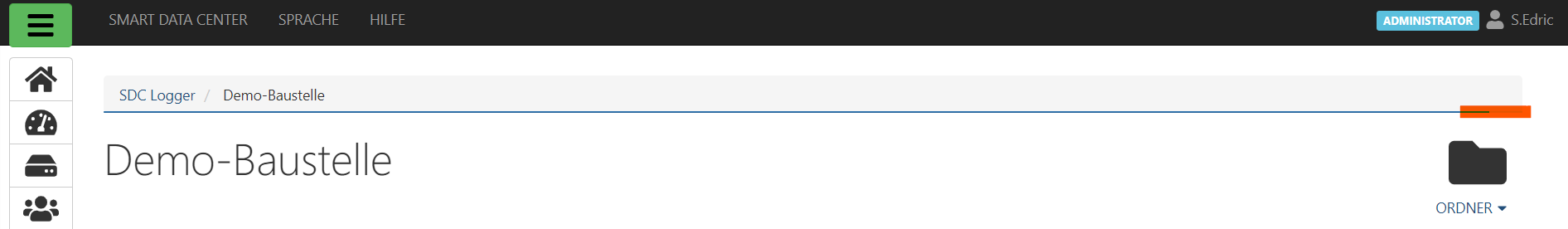
Changes must be saved using the “Save changes” button (). Otherwise they will be lost after reloading or exiting the folder page. The following is also important to know: 1. By default, folder pages are automatically reloaded at regular intervals. This means that changes can be lost. A corresponding loading bar shows when this will be the case (highlighted in orange in the figure below). Before this happens, the changes should be saved. If desired, the automatic update can of course also be temporarily switched off so that you are not disturbed when editing the visualization. The corresponding option can be found here. 2. The links found on the visualization, for example that link to measuring points, are also active during editing. Clicking on a link can result in a new page being loaded and unsaved changes being lost.


If desired, all markers can be set to a default position. This can be useful, for example, if the background image of the visualization has been changed and all markers must be rearranged. The required button “ Reset all objects” (German: Alle Objekte zurücksetzen) appears in the edit mode directly at the top of the visualization.
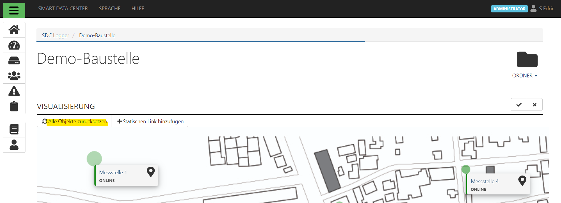
Add Markers
Add measuring point and folder markers
Under the standard settings, the visualization can be found on the folder main page. Below this is a list of all measuring points and folders belonging to the project (in order to be able to see them, the folder / measuring points tab must be selected).

If the edit mode is activated, one of these entries can now be added to the visualization by dragging&dropping it.
To do this, move the mouse over the name of the folder / measuring point (highlighted in blue, by the icon or in the column “Name”)
Hold down the left mouse button and drag the link onto the visualization
Then let go
Here is the corresponding process in .gif form:
Add channel markers
This process requires a few more steps than is the case for measuring point or folder markers. Below are the instructions for this.
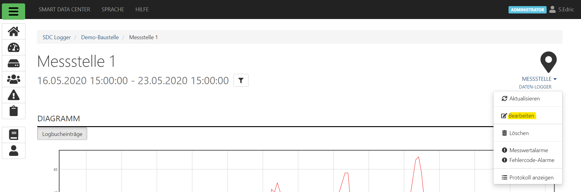
1. Open the page of the corresponding measuring point, open the context menu by clicking on the measuring point icon

, select the item “Edit”.
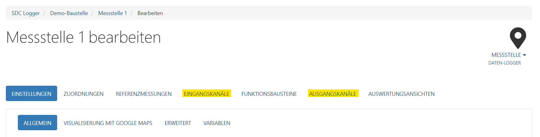
2. Now either select the Input or Output channel tab, depending on the desired channel to be added to the visualization.
3. Click on the edit icon

4. Place a checkmark in the “Show in visualization” column and click on the “Accept changes” icon (same icon: 

5. After returning to the folder main page, the corresponding channel marker (identifiable by the icon 
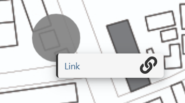
Add static link markers
A marker can also lead to a user-definable URL . For example, external websites can be set as markers at a suitable point on the visualization so that the link can be accessed quickly.
1. To add such a marker, simply click on the “Add static link” button. This appears as soon as the edit mode is activated.
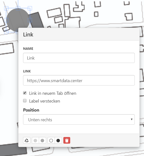
2. The marker that now appears has a link icon 
3. The name of the marker and the link address can be entered by clicking on the marker. The window that now opens has the corresponding input fields. In addition, the field “Open link in new tab” can be used to set whether the link opens in a new browser tab or is opened directly in the open window.
Edit Markers
A marker that has been placed can now be edited and adjusted. The various options for this are explained below.
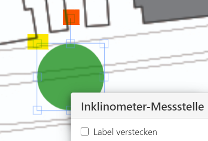
1. Scale the size of the marker
Select the marker by clicking on it. A frame appears around the marker, on which small square dots are drawn (marked in yellow in the image). Click on one of these points and move it with the left mouse button pressed to move the corresponding corner / side of the marker or to scale the size of the entire marker. The marker can be rotated by pulling the point in the middle above the marker (marked in orange).
.gif
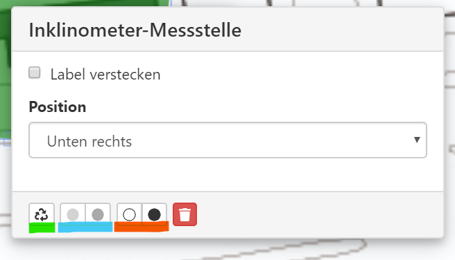
2. Changes via popup menu
When the edit mode is activated, clicking on a marker (not on its label!) will bring up a popup menu. This offers various options for optically adapting the marker. These are explained below.
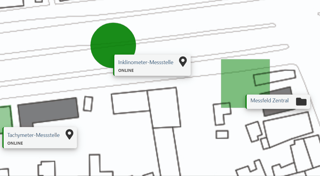
Hide label: (German: Label verstecken) Normally, each marker on the visualization has a so-called “label” next to it, a text box with the name of the associated measuring point (in the form of a link that leads directly to the page of the respective measuring point) and its online status. If the “Hide label” option is activated by ticking the box, the label is hidden. This means that only the marker is immediately visible on the visualization, the label only appears when you move the mouse over the corresponding marker.
Illustration with marker with visible label (left) and marker with hidden label (right):
Position: By default, the label appears on the right below the associated marker. By “expanding” this point, an alternative position of the label can be selected.
Change shape 
By default, the shape of the marker is a circle, by pressing this button (marked green in point 2) the shape can be changed to a triangle or a square. Each time the button is pressed, the shape of the marker changes.
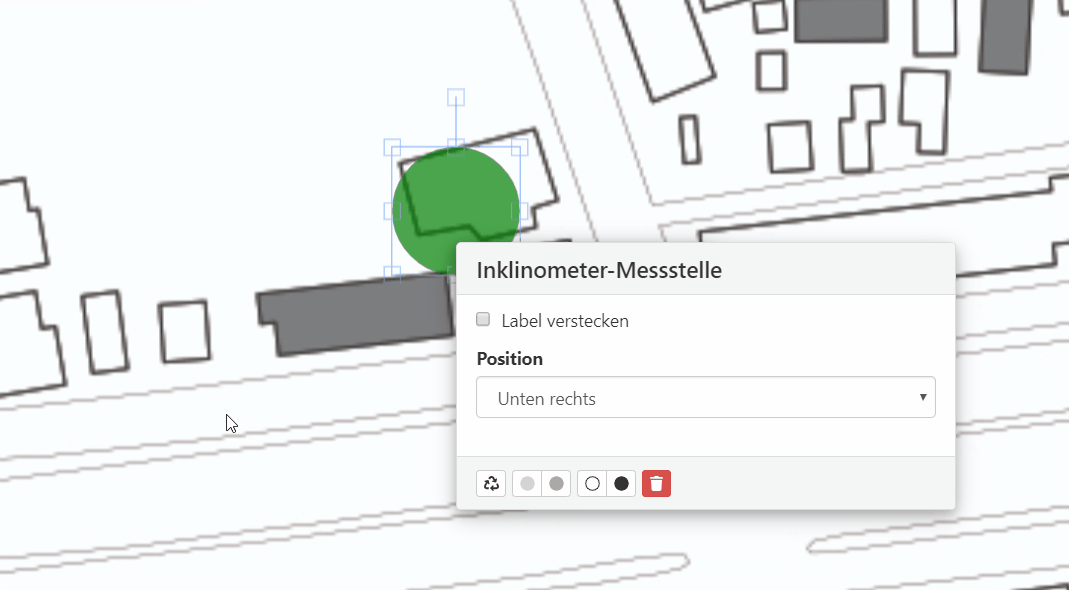
Change transparency: The two buttons (marked blue in point 2) enable the marker to be made more transparent, i.e. more transparent (left button), or less transparent (right button), pressing the corresponding button repeatedly increases or decreases the transparency further.
Change outline thickness: The two buttons (marked orange in point 2) change the thickness of the outline of the marker. You can decrease (left button) or increase it (right button). The outline can be completely modified to suit your own needs, e.g. so thin that it is basically no longer visible, or a clearly visible thickness.
Delete marker 
Change transparency: The two buttons (marked blue in point 2) enable the marker to be made more transparent, i.e. more transparent (left button), or less transparent (right button), pressing the corresponding button repeatedly increases or decreases the transparency further.